The color on the packaging is the factor that affects the most active visual, so the color design of the packaging is very important.
Determine the total color tone
The overall sense of packaging color is gorgeous or simple, depending on the total color of the packaging color.
The total color tone is directly reflected on a basic color attribute of hue, lightness, and purity. Such as Ming tune, dark high, fresh tune, gray tune, cold tune, emphasis, weak tune, soft training, hard tune, readjustment and so on.
Area factor
In addition to hue, lightness, and purity, the size of the color area is an important factor that directly affects hue. Color matching first considers the arrangement of large-area colors, and large-area colors have long-distance visual effects in packaging displays. In addition, when the contrast between the two colors is too strong, the area of ​​one of the colors can be enlarged or reduced without changing the hue, purity, and brightness, and the adjustment can be performed.
Visibility
The visibility is the clarity of the color hierarchy. Good visibility is very important in visual communication design such as packaging and advertising. On the one hand, viewing the degree of eye color itself, on the other hand, we must look at the contrast between colors. The principle and method are also introduced in detail in the advertising design. Reference can be made to its contents for the color design of packaging and decorating.
Accent color
The accent color is the key color in the total color tone, and is the color used in combination with the area factor and the visibility. It is generally required that the brightness and the degree of constitution are higher than the surrounding colors, and the area should be smaller than the surrounding colors, otherwise the emphasis cannot be achieved.
Interval color
Interval coloring refers to the use of another color, such as spacing or sharing, between adjacent and contrasting colors, which can enhance coordination and reduce contrast. The interval color itself is mainly neutral black, white, grey, gold, and silver. If a colored interval is used, it is required that the interval color and the separated color have large differences in hue, lightness, and purity.
Gradation
Gradient is a gradual change of color, hue, lightness, purity can be used for gradual changes. Gradient color has a harmonious and rich color effect, and is used more in the color processing of packaging.
Contrasting colors
Contrast color is different from accent color, which is the color with similar area and hue contrast. This kind of color has a strong visual effect and is therefore advertising.
Symbol color
This is a conceptual color that does not directly imitate the color characteristics of the contents, and is used as a symbolic application according to the common understanding of the consumers. Mainly used for the performance of certain spiritual attributes of a product or the performance of a certain brand of ideas. Such as the packaging of Chinese cigarettes choose to symbolize the color of the Chinese nation - red.
Logo color
The color of the logo mentioned here is not the color of the trademark, but the color used to distinguish the packaging of different kinds or similar products of different varieties. For example, different colors are used to distinguish the packaging colors of different components of the same brand of household chemicals. In processing, the area, shape and position should be changed.
Auxiliary color
This is an opposite color to the accent color, and it is an auxiliary color method for the effect of the total color tone or the emphasis color adjustment to enhance the tone level and obtain a rich color effect. In the design process, we must be careful not to distract our guests and not blindly abuse them.
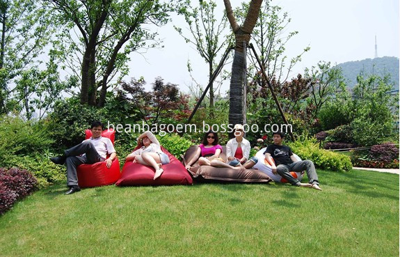
Each one is made in 100% waterproof fabric ensuring these bean bags are built for use outside, plus, we`ve even created matching outdoor garden accessories to keep your garden on trend. The contemporary outdoor range includes everything from supportive toddler Outdoor Bean Bags to giant outdoor bean bags that can sit two or more people, as well as bean bag footstools and fibre-filled cushions. If you`re in need of some extra garden furniture then garden bean bags are a practical and bright addition. The waterproof fabric means any BBQ food or drink spillages can be easily wiped clean and the huge range of bright colour options, shapes and styles means your outdoor living space will make an impact. Our beautiful outdoor cushions are filled with thick fibre to create a high quality garden accessory and are available in on-trend print designs or plain bright colours. You can have fun mixing and matching the different cushions together along with your choice of bean bag furniture. Picnics and playtime in the garden can be fun and safe with our bright and durable kids outdoor bean bags. Double stitching and double zips on our bean bags will help give you peace of mind. During the summer months you can enjoy using your Outdoor Bean Bag chairs in the garden as a sun lounger, and in colder months they will become the cosiest seat in the house – making it an investment for use all year round. Bean bags are so lightweight that even if the British summer means you have to make a dash for the living room, you can easily and quickly carry your outdoor bean bag furniture indoors. Outdoor bean bags are designed for use outside but must be stored inside when not in use. Spruce up your garden, patio, conservatory, sun room or indoor living space by purchasing these bright.

Outdoor Bean Bags
Large Garden Bean Bags,Outdoor Garden Bean Bags,Garden Bean Bag Chairs,Night Garden Bean Bag
Hangzhou Mengzan Hometex co.,ltd , http://www.popbeanbag.com